RE-BRANDING / EDITORIAL
NBDA - OUTSPOKIN'

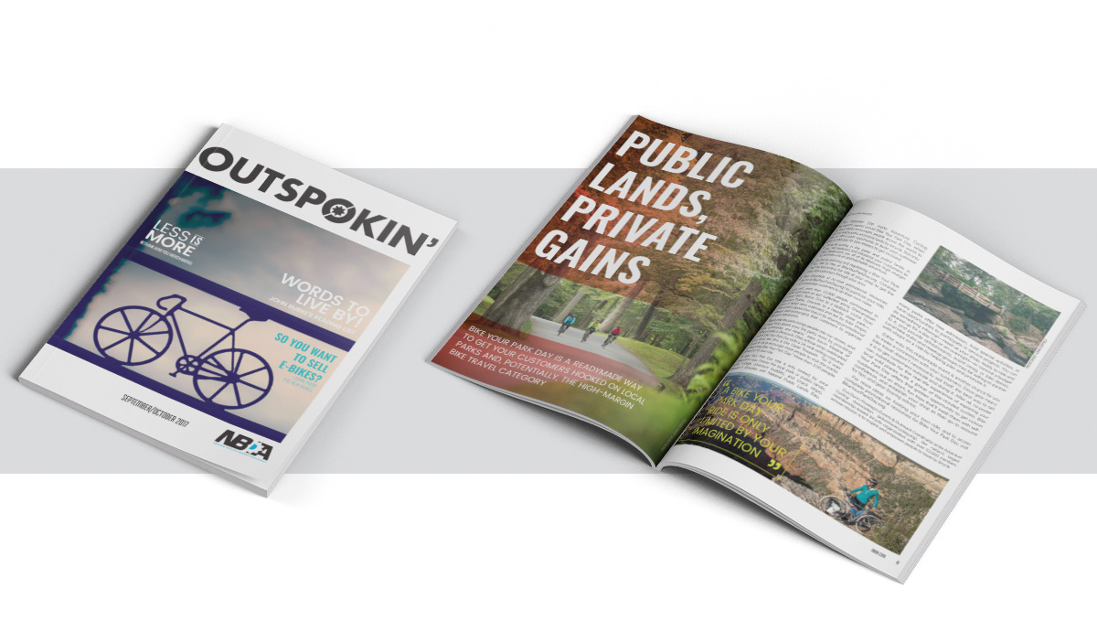
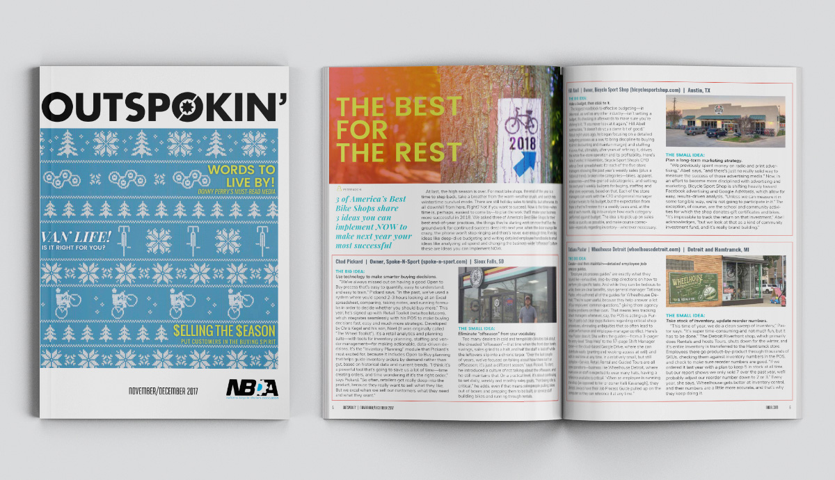
Having not had an update since its inception, The NBDA’s member publication Outspokin’ was in need of a complete creative refresh, as well as a revised focus that took into account the demands on its readers time. Creatively Outspokin’ was designed to transition itself into a digital platform, with a more dynamic look that could easily move to an online zine and establish itself as centerpiece of the NBDA’s communication platforms. The content focused itself around “actionable” items, shortening the length of articles, layering in more step-by-step visuals, partnering with vendor partners (experts in their space) and marking a new era of change for the NBDA.
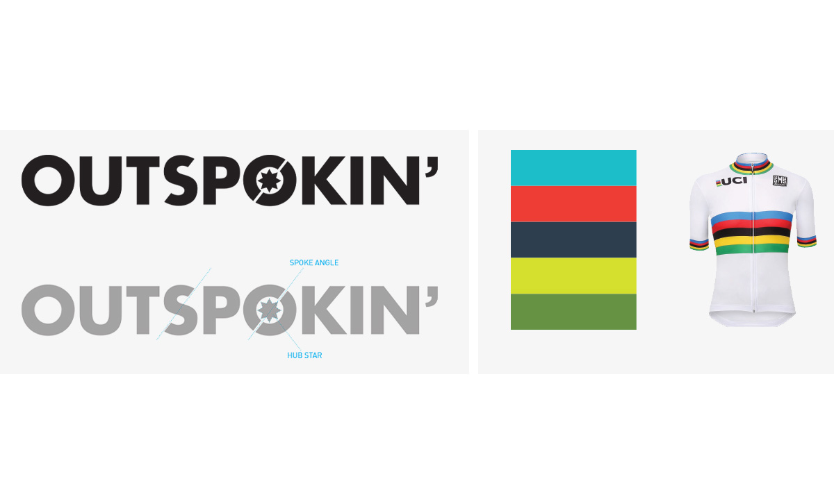
The new title treatment for Outspokin’ is a bold geometric font customized to express to the idea of motion and to hint at the central mechanics of a bike wheel. The color palette is a stylized take on the UCI rainbow jersey. The bold, bright colors allow for variety in page layout and design elements.


