Loader logo
BRANDING / PACKAGING / WEB

WILDISH

Divider

Wildish is a Colorado-based company that makes plant-based, selfcare products that empower the fertility, pregnancy and postpartum experience. The overall look and feel of the brand was created to break out of the expected “soft and demure” treatment that women’s pregnancy products tend towards. It is bold, bright and empowered.

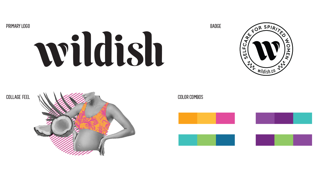
The Wildish logo is a custom-drawn font that takes cues from traditional calligraphy while maintaining a clean and modern aesthetic. The upturned ends and tapered tops of each character create a playful and feminie line to the logo. The “w” includes a softly curving leaf icon making up one part of the letter and hearkens to the natural, plant-based healing that is at the core of the brand.

The color palette is made up of vibrant colors that work in color combinations. These combinations are applied to the packaging as per product category to create a stunning rainbow on-shelf.

Project Image

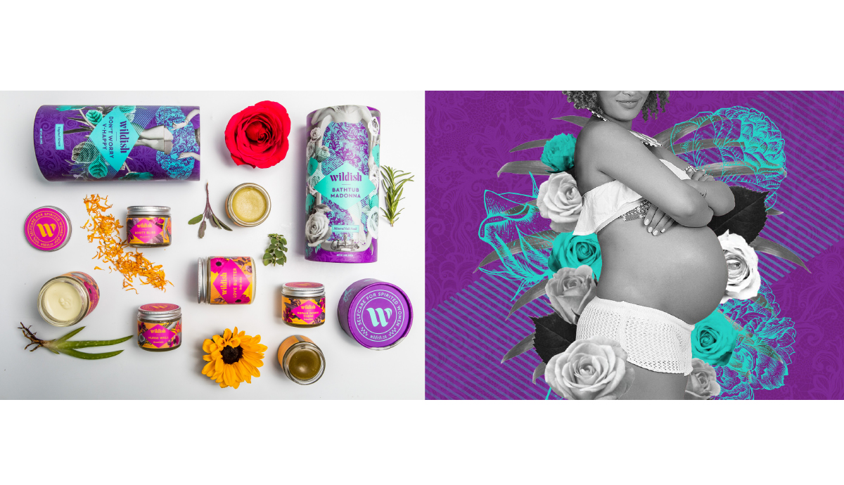
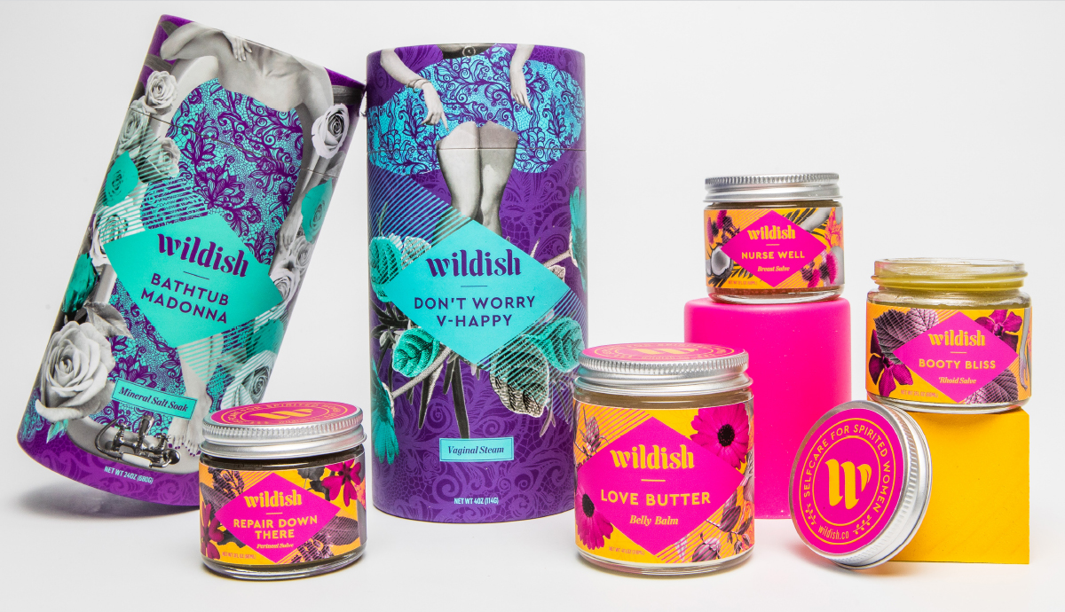
The packaging designs for Wildish are vibrant, powerful collages created to be eye-catching and enjoyed.

The collages are made up of diverse and strong women’s bodies, pop art inspired ingredient photograhy and traditional botanical illustrations of the plants used in the products. Brightly colored lace textured throughout mixes in some hints of the traditional feminine with a modern take.


Project Image
Project Image